Case 07Selected Work
WizFixComputers
- Client
- WizFix Computers
- Location
- Diamond Bar, CA
- Discipline
- Web Design + Brand Direction
- Year
- 2026
A neighborhood computer repair, IT and printing shop that had earned its reputation in person — and needed a presence that said so before anyone walked in.
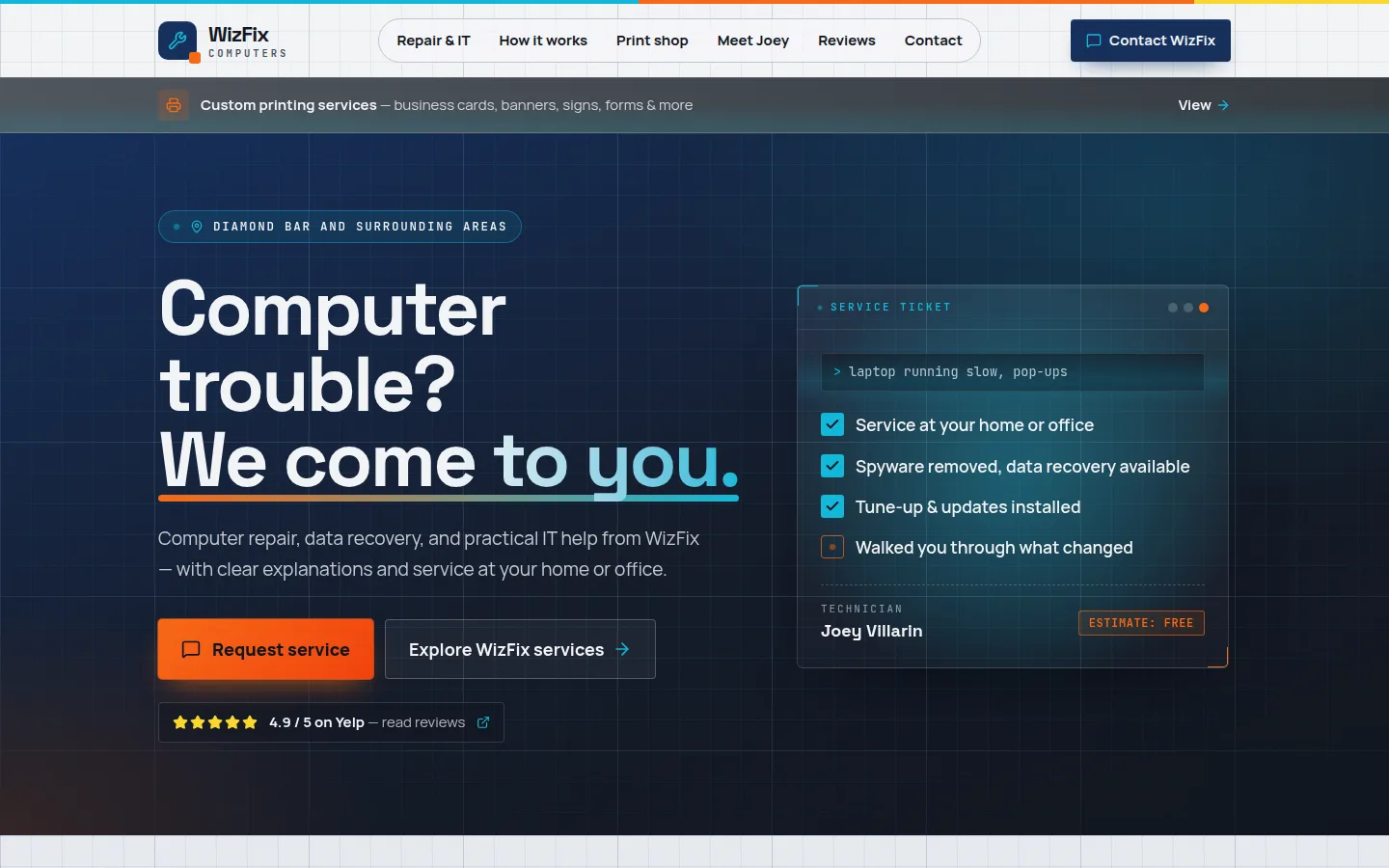
Fig. 01 — Published homepage
01What Joey needed
A major redesign — one that finally looks like it belongs in the tech industry.
WizFix had the expertise. The brand needed to look as capable as the people behind the counter.
02What I heard
Three businesses under one roof, and a customer who needs to understand all of it in a few seconds.
01
Clarity
Repair, IT support and printing were blurred together. Each needed a clear door so customers could find their problem — and the fix — fast.
02
Trust
Handing over a laptop means handing over your life. The presence had to feel steady, accountable and local, not like a template.
03
Discoverability
Most customers start with a search like “computer repair near me.” Structure, copy and local signals had to work for them.
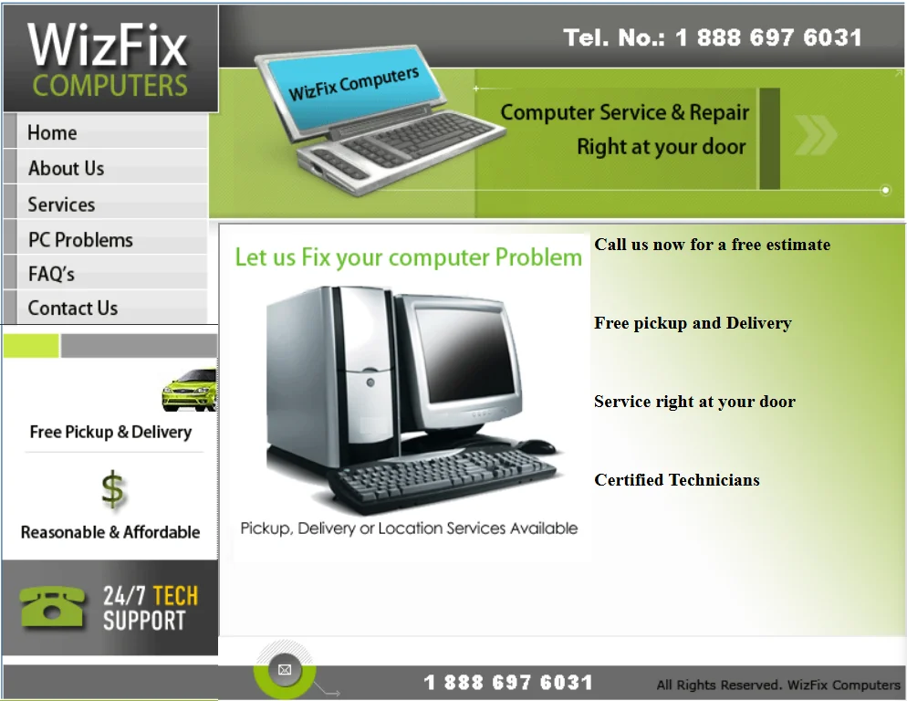
Before: owner-supplied capture of the former website, cropped to remove desktop overlays. After: published WizFix website.
03What I built
- 01
A calmer brand direction
A restrained type system and a confident palette that reads “established shop,” not “side hustle.”
- 02
Service architecture
Distinct paths for Repair, IT and Printing, each with plain-language explanations and a clear next step.
- 03
Trust built in
Hours, location, process and what-to-expect content surfaced where hesitation usually happens.
- 04
Local search foundations
Semantic structure, page titles and location cues so Diamond Bar neighbors can actually find the shop.
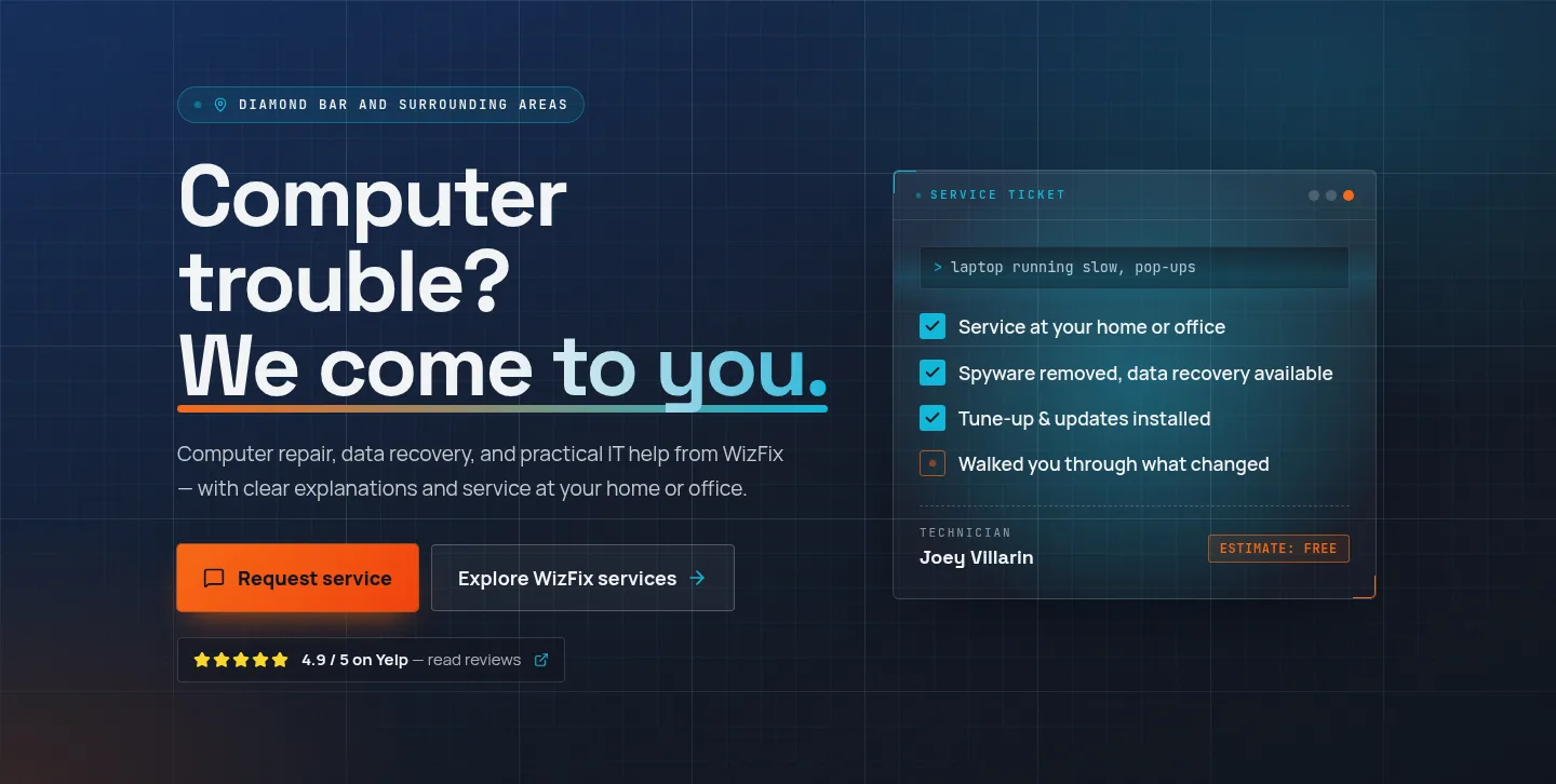
Fig. 03 — Published homepage detail
Fig. 04 — Published site across devices
Most customers meet the shop on a phone, in a hurry, with something broken. It had to work there first.